Writer: Tiffany Whisner, Coles Marketing
For eight decades, Easterseals Crossroads has been a leader in the Indianapolis community for people with disabilities.
 “Easterseals Crossroads has been around since 1936 — initially it began as a social club for 12 teenagers with disabilities,” said Katie Harris, director of design and communication at Easterseals Crossroads. “Our Easterseals affiliation came years later in the late 1980s. Up until then, we were known as Crossroads Rehabilitation Center. But we have been responding to needs in our community for 80 years, which is amazing if you think about it.”
But in 80 years, the way the world views disability and the disability rights movement have come a long way — battling stereotypes, stigmatization and marginalization of people with disabilities to the signing of the Americans with Disabilities Act (ADA) to ensure the equal treatment and equal access of people with disabilities to employment opportunities and public accommodations.
With the change in the way the world looks at and defines disability comes the time for a new vision and expression of Easterseals’ same values with a refreshed brand.
A reason behind revitalization
“Our new look that is about to launch was the result of almost two years of research,” Harris said.
The national Easterseals organization partnered with a firm to conduct extensive research into how the brand resonated with various audiences. They conducted focus groups that included the general public, Easterseals affiliates, volunteers and donors. The conclusion was a brand revitalization, giving the organization a new look, feel and philosophy to stay relevant nationwide.
 “The brand revitalization is so exciting, not just for our organization, but also for the individuals living with disabilities whom we serve,” said Easterseals Crossroads President and CEO J. Patrick Sandy. “As we turn the corner into our 80th year, we are poised to help influence and change the way the world views and defines disability by continuing to make positive and profound differences in people’s lives.”
Also called the brand renaissance, it has given Easterseals affiliates the chance to reconnect with their local centers of influence.
“It has given the more than 70 affiliates the opportunity to strengthen themselves in a consistent, cohesive way,” Harris said. “It also gives all of us the perfect opportunity to reintroduce ourselves to our communities.”
Taking on disability together
One of the major changes to Easterseals Crossroads is a new tagline. According to Easterseals, the tagline is a compact, high-impact public expression of the organization’s brand strategy.
The old tagline for Easterseals Crossroads — The emphasis is on ability — will become “Taking on disability together.”
 “We have always been focused on ability, and we always will be,” Harris said. “Our programs, staff, core values and high-quality service to our community are not changing in any way. Ability is the basis of everything we do — every goal we set, every objective we attempt. The new tagline begins the movement that unites our affiliates, partners, donors, volunteers and consumers for consistent service for individuals with disabilities in all communities.”
“Taking on” highlights owning and actively facing the issue, day in and day out. “Disability” reminds the world of the Easterseals cause, expertise and leadership. “Together” speaks to the collaborative work across affiliates, within the community and alongside the people served.
In addition to a new tagline comes a new brand architecture, logo and color palette.
“The impact of this new look, feel and philosophy provides our agency with the opportunity to better present ourselves to those who use our services,” Harris said. “Our services are now aligned under the categories of live, learn, work, play and act. The website is also much easier to use, much more streamlined and understandable. We want our consumers, donors, volunteers and partners to know they can trust that we continue to hold their best interest at the very core of our service delivery.”
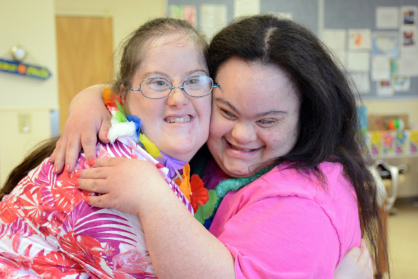
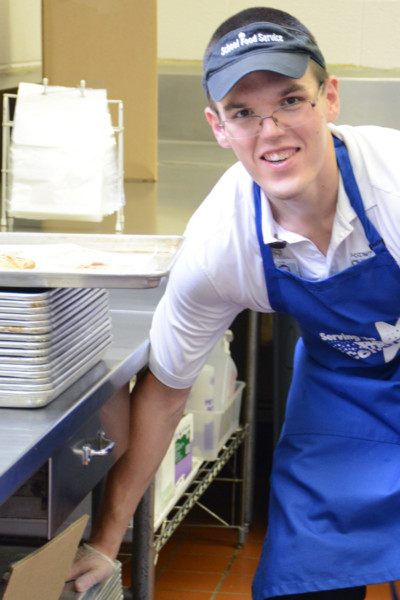
“Live” programs are those hands-on, comprehensive, vital programs and support to help people reach their full potential, such as day services and assistive technology. That includes the INDATA Project at Easterseals Crossroads.
“The INDATA Project does amazing things every day,” Harris said. “They have great people working in the assistive technology center, and they have always done a tremendous job of spreading the message of what they do and what services they can offer Hoosiers around the state. This new look will just give them the chance to continue doing what they do best with that fresh, new image standing behind them.”
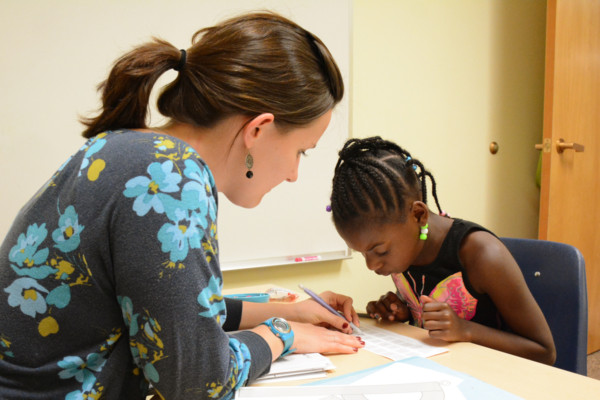
 “Learn” programs are designed to help people learn, or re-learn, basic functions and master skills needed to develop and thrive, like life skills training, caregiver training and education programming.
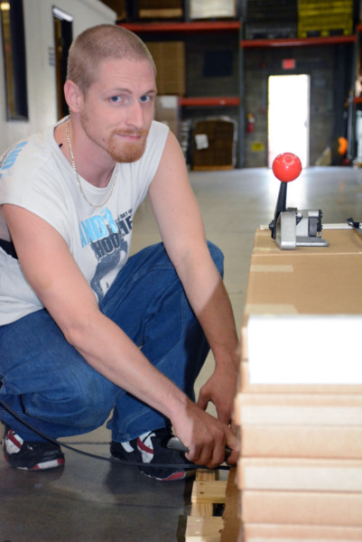
“Work” programs are training, placement and related services that help people prepare for the workforce — because meaningful work is often the key to overcoming challenges and improving one’s quality of life.
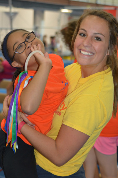
“Play” programs, like camp, respite services and recreation programming, are fun, healthy programs for children, adults and caregivers to relax, connect with friends and engage in constructive activities — all necessary to living the best life possible.
And “act” programs include volunteering, advocating, donating and participating in events that inspire and sustain the Easterseals cause.
From inception to realization
“I have been working on the rebrand — or renaissance — now for almost two years,” Harris said. “In the initial stages of the research gathering, our national organization held focus groups with representation from five affiliates across the country, and I was part of that group. Siegelvision, the firm we worked with, really wanted to understand the roles of these five affiliates in their communities.”
 Once the brand architecture of helping people live, learn, work, play and act was established, the visual look had to be created.
According to Easterseals, the new logo was inspired by its work being infused with optimism, striving toward its full potential. And the new colors are warm and inviting, reinforcing a friendly, open and accessible nature.
“Since the early stages, I have been focused on designing and creating our new website, presentation and program materials so we can project our new clean, fresh, exciting look to the public in November,” Harris said. “I feel this renaissance has been a great exercise for the whole agency; we are all working very hard to maintain a new consistency.”
 How does she describe the new brand in one word? Fresh.
“Since I have been working with our new look for a while now, I am always struck by how fresh and clean it looks. I love that we are gathering behind this clean, fun image to present all the great things we have always done. I love that we are not changing the core of our service delivery — we are just taking this opportunity to ‘repackage’ ourselves and appeal to people who may have overlooked us in the past.”
The revitalization will be realized next month, the next major milestone on the Easterseals Crossroads timeline.
“Most of us will move in and out of disability in our lifetimes, whether we do so through illness, an injury or merely the process of aging,” Sandy said. “It is estimated that one in five adults in the United States is living with a disability; this represents the largest minority group in the country. And Easterseals Crossroads is the leading community resource dedicated to providing support to those individuals living with a disability.”
